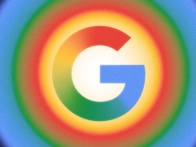
Google has officially updated its iconic “G” logo for the first time in nearly a decade.
The original version, introduced in 2015 alongside the switch to the Product Sans typeface, featured four distinct solid color segments in red, yellow, green, and blue.
Now, those colors blend together in a smooth gradient, giving the logo a more modern and fluid appearance.
This refreshed design is currently visible in the latest versions of the Google app on iOS and on Pixel smartphones.
The updated gradient design seems visually aligned with the aesthetic of Google’s Gemini logo.
However, the gradient “G” has not yet been rolled out across all platforms. Android devices (excluding Pixel) and the web version of Google still display the older version with the solid color blocks.
It’s still uncertain whether Google plans to update the “G” icon across its broader ecosystem or if this redesign is limited to specific products for now.